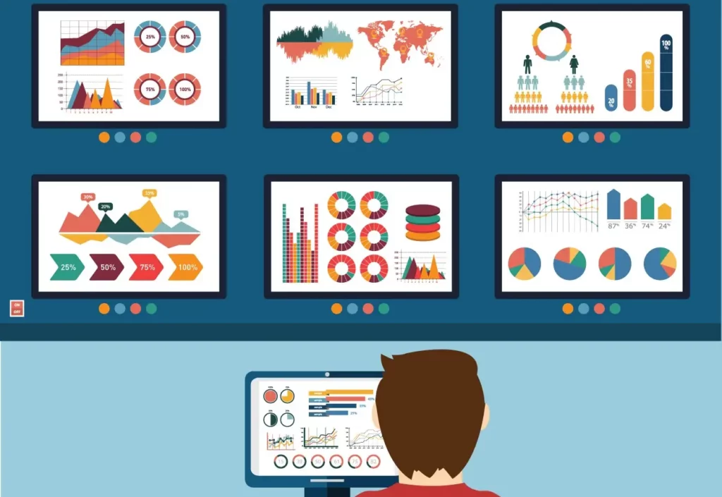
Explore the data visualization tools big data professionals use to gain insight into patterns and trends.
At a time when data is extremely necessary for experts in business and digital technology, ISDI’s Master in Internet Business (MIB) is a benchmark in its field to help companies make the most of their resources.
Participating in this program will allow participants to acquire new knowledge on business strategy and models, product creation, or data management and interpretation.
Data Visualization as a Work Tool
Our brain works, so graphic elements are much easier to process than if we are shown tables or just text. This is because our visual brain allows us to extract more information and better remember what is shown. When what we have before us is an image.
When we are in front of a data table, retaining and interpreting the information is much more difficult than if what we are shown is a graph. In this way, thanks to data visualization, any information that is being displayed can be compared, understood, and processed much better. For this reason, when viewing data, we find the most graphic way to see it and thus be able to interpret it more easily.
The main benefits of data visualization are:
- It manages to transmit complicated or detailed results to other company members.
- Analyze trends that may not be visible to the naked eye.
- Compare the figures of the large blocks of data.
What is Data Visualization?
Data visualization is the graphical representation of data, organizing and presenting the information to be understood as easily as possible.
It is possible to understand and face the data more effectively through all kinds of visual tools, such as maps, graphs, or infographics. Thanks to this, the data is collected in a more accessible way, and it is possible, at a glance, to discover the trends, values, or patterns that the data obtained shows.
Although this type of representation has been used for years to see the data, today, using new technologies, it is possible to create quick visualizations that improve work efficiency.
Related: Database Managers and Data Warehouse: Functions and Types
Chart Types for Data Visualization
Data is considered one of the greatest values available to a company, so much so that having professionals in it makes it possible for them to interpret them correctly and strategically. In addition, this milestone can greatly change the results after the decision-making according to them. Hence, the relevance of considering it to improve your company through data.
Today, we can find a wide variety of graphs with which the data can be analyzed, and each of them will provide a different vision and improve the interpretation of these in one way or another. The main types of graphs that we can find are:
- Column chart: One of the most used, it compares exposed data between two axes with metrics represented. An example of this type of chart is tracking monthly sales figures.
- Bar graph: graphical representation of the results of a statistical analysis. It is reflected on two axes, and the bars’ length indicates the data. It is used to compare the parts of a whole.
- Line Chart – Designed to detect trends or changes that occur over time.
- Dual Axis Chart – Uses three axes and shows a relationship between different variables.
- Pie graph: It is shaped like a pie from which the portions are separated proportionally from a whole.
- Scatter plot: Different variables are plotted along two axes, looking for similarities in a data set.
5 Data Visualization Tools
The different data visualization tools are key to helping the workflow much more efficiently. This type of data analysis software takes some of the effort out of the way and makes it easier to understand and interpret. Many examples of data visualization are possible thanks to this program that allows you to make them real.
The 5 most popular data visualization tools today are:
MS Excel
Microsoft Excel is one of the pioneering programs and also one of the most widely used. It allows you to create tables and graphs and analyze big datasets.
The advantages of using Microsoft Excel to analyze data are very varied:
- Its popularity allows very different profiles to use and understand it, making teamwork much more effective.
- It is compatible with a wide variety of devices.
- It has a wide variety of templates to make all kinds of reports.
- It has highly developed technical support to which you can consult all doubts and problems.
- Excel charts are straightforward; cells allow you to cut and paste data from other applications like Word.
In the same way, it also has different disadvantages that can be a problem when using it:
- Version control is complicated when it comes to sharing them between different teammates. This can generate a significant amount of errors when introducing new changes.
- Templates can be very restrictive when it comes to including specific changes.
- Password-locking documents is a significant waste of time regarding read-only versions.
- It is straightforward to make a typo, and this can lead to an inaccuracy problem.
Microsoft Power BI
Microsoft Power BI is a tool similar to Microsoft Excel but with a great evolution. It has as a novelty the possibility of generating data visualizations individually or within a report.
The advantages of using Microsoft Power BI as a data visualizer are:
- It allows for unifying analytical processes and managing data and information extracted from different platforms.
- It is one of the most visual and agile tools.
- It allows integration with the rest of the Microsoft platforms.
- It has an important guarantee of data protection and controls the accessibility of different profiles, external or internal.
On the other hand, the disadvantages that can be linked to Microsoft Power BI are:
- The free version of this tool is minimal when it comes to sharing data and generating reports.
- It is subject to use with a Windows operating system.
- It requires a very powerful computer to analyze a high volume of data.
Google Charts
Simple visualizations can be generated from different data sets using the Google Charts tool.
As advantages of Google Charts, we can highlight the following:
- It is one of the tools with easier use and is perfect for beginners because it is very intuitive.
- It has excellent value for money.
- It has great technical support in case you need the help of experts when handling it.
The disadvantages of Google Charts for data visualization are:
- Despite its ease of use, it isn’t easy to customize the reports generated with it.
- It requires a very powerful internet connection to upload the data.
Zoho Analytics
Zoho Analytics is a powerful, highly scalable analytics platform for application deployment and custom analytics integrations.
The main advantages of Zoho Analytics are:
- It has a significant number of default templates.
- It allows the insertion of data visualizations on a web very simply.
- The company develops tutorials to facilitate its use and can be integrated with more than 500 applications, including social networks.
Among the disadvantages is that it requires superior knowledge to use it.
Datawrapper
Finally, the Datawrapper tool allows you to create maps, graphs, and interactive tables for free and, in addition, with the possibility of using it in Spanish.
This data visualization tool has important advantages that make it very accessible:
- One of the pros of using Datawrapper is that it has a built-in colorblindness checker that makes your visualizations colorblind-friendly.
- It is compatible with mobile devices.
- It has a multitude of tutorials and texts to facilitate its use.
However, Datawrapper has disadvantages such as:
- It only allows the import of data from some sources.
- The paid plans are costly even if you have a pervasive free plan.
Thanks to these and other data visualization tools, it is possible to create clear images that increase the possibility of understanding data and making decisions that help boost the company’s growth.
Data Visualization Trends
The data visualization market is expected to be worth more than $5 billion by 2026. This means that in the coming years, businesses will be increasingly based on data analysis and on having tools that allow their graphic representation.
This situation means growth in Big Data, greater access to visualization from any device, and even the creation of customized reports for specific roles. In this way, the democratization of the use of data and the possibility of access by a greater number of professionals will imply its promotion in small and medium-sized companies, making the data visualization market grow exponentially.